Military Officers Association of America

Symbol of Service. Standard of Respect.

When tasked with creating a unified brand identity honoring all branches of the U.S. military—plus NOAA—the design needed to do more than look sharp. It had to mean something. It had to carry weight.

The Brief
Create a bold, modern logo system that honors the legacy of service while standing strong across applications—from digital to ceremonial—without losing clarity, symbolism, or respect.

The Big Idea
A single emblem. Seven stripes.

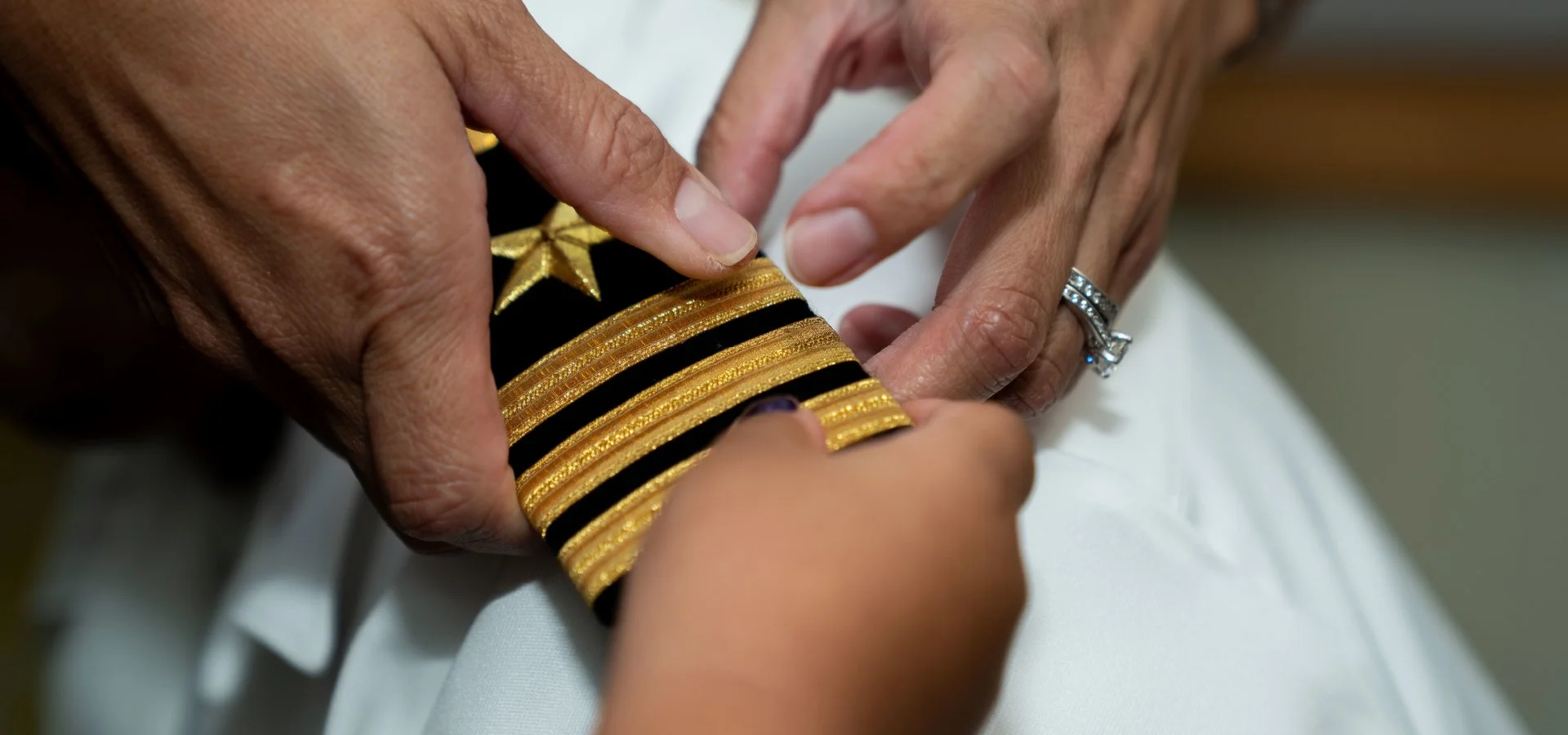
The new logo features six stripes for each branch of the U.S. military, plus one for NOAA, coming together to form a stylized military rank ribbon. Visually, the design nods to the shape of a draped American flag, creating a powerful tribute to those who serve—and those who have served.

Every angle, every stripe, every negative space is intentional. It’s not just a logo—it’s a visual salute.

The Execution
Beyond the mark itself, the comprehensive brand guide ensures every deployment of the identity is handled with precision and reverence. It includes:

  • Clear rules on logo usage, spacing, and color application

  • A defined design language rooted in discipline, strength, and unity

  • Strategic guidelines to uphold tone, voice, and visual consistency across all platforms

Whether on a website, uniform patch, or event banner, the identity holds its ground—confident, clean, and deeply meaningful.

The Impact
This logo didn’t just check boxes—it raised the standard. It:

  • Unified diverse military and federal service entities under a single, powerful symbol

  • Earned internal adoption and external recognition for its thoughtful design

  • Set a precedent for respectful, modern branding in service-driven institutions

The Legacy
Some logos market. Others memorialize. This one does both.

Rooted in symbolism. Designed with purpose. And built to last—just like the people it represents.